


Welcome, fellow horology enthusiasts, to a deep dive into the very soul of a timepiece: the dial. Often referred to as the “face” of the watch, the dial is where art meets science, personality meets function, and first impressions are forged. For the uninitiated, it might simply display the time. But for us, it’s a canvas, a complex landscape of details that tells a story far beyond the hour and minute.
Understanding the anatomy of a watch dial is fundamental to appreciating haute horology. It’s the primary interface between you and the intricate micro-engineering within the case. So, let’s dissect this canvas, component by component, and uncover the language it speaks.
The Base: The Foundation of Character
It all starts with the base, the foundational canvas upon which everything is built. The material and finish of the base set the entire tone for the watch.
- Materials: While brass is the most common base (often plated with gold or rhodium for durability and luster), high-end watchmaking explores far more exotic territories.
- Enamel: A hallmark of luxury, enamel dials are created by fusing powdered glass onto the base metal at extremely high temperatures. The result is a deep, glossy, and incredibly durable surface that is virtually impervious to fading. Grand Feu (high-fire) enamel is the pinnacle of this art, requiring immense skill to avoid cracks or bubbles.
- Guilloché: This is a decorative technique where intricate, repetitive patterns are mechanically engraved into the base metal using a rose engine or straight-line machine. The resulting play of light across the grooves creates a mesmerizing, textured effect. Think of the iconic dials of Breguet or the Clous de Paris pattern on a Patek Philippe Nautilus.
- Stone: From the cosmic allure of meteorite (etched with a unique Widmanstätten pattern) to the elegant veins of lapis lazuli, malachite, or tiger’s eye, stone dials offer a unique, organic beauty. No two are ever alike.
- Carbon Fiber & Technical Materials: In modern haute horology, materials like carbon fiber, ceramic, and titanium are used for dials, emphasizing lightness, strength, and a contemporary, technical aesthetic.
The Hour Markers: The Points of Reference
These are the indices that guide your eye to the time. Their design is a crucial element of the watch’s personality.
- Applied vs. Printed: This is a key distinction. Applied markers are three-dimensional elements crafted from metal (often gold or platinum) and then fixed onto the dial. They are a sign of a higher-quality timepiece, adding depth and a play of light. Printed markers are simply ink or paint applied directly to the dial surface. While common on tool watches and certain classic styles, applied markers are generally associated with superior craftsmanship.
- Styles: The variety is endless:
- Sticks/Batons: Sleek and modern.
- Roman Numerals: Classic and elegant.
- Arabic Numerals: Sporty and highly legible.
- Diamonds: A touch of brilliance and luxury, often used as markers in jewelry watches.
- Breguet Numerals: Exquisitely crafted, slender numerals with a hollowed-out “apple” at the tip, a timeless symbol of refinement.
The Hands: The Pointers of Time
The hands are the dancers on the dial’s stage, and their design must harmonize with the markers and overall style.
- Shape and Legibility: The primary role of the hands is to be read clearly and quickly. Styles like Mercedes (Rolex Submariner), Sword, Dauphine, Breguet (with their iconic “pomme” circle), and Skeleton (where the center is cut out) are all designed with specific legibility and aesthetic goals in mind.
- Lume: Short for luminescent material, lume (like Super-LumiNova or Tritium) is applied to the hands and markers to allow for reading in the dark. The quality, application, and even the color of the lume (“patina” on vintage-style watches) are details cherished by collectors.
The Subsidiary Dials: The Complication Canvases
Also known as “registers” or “counters,” these are the small dials embedded within the main dial, housing additional functions or complications.
- Chronograph: Typically, you’ll find two or three subsidiary dials displaying elapsed minutes, elapsed hours, and running seconds.
- Calendar: A small aperture or sub-dial showing the date is the most common. More complex versions include day, month, and even moonphase displays, which is itself a beautiful sub-dial depicting the lunar cycle.
- Small Seconds: A separate seconds hand on its own sub-dial, often positioned at 6 o’clock, is a classic feature that adds visual balance and a touch of traditional watchmaking.
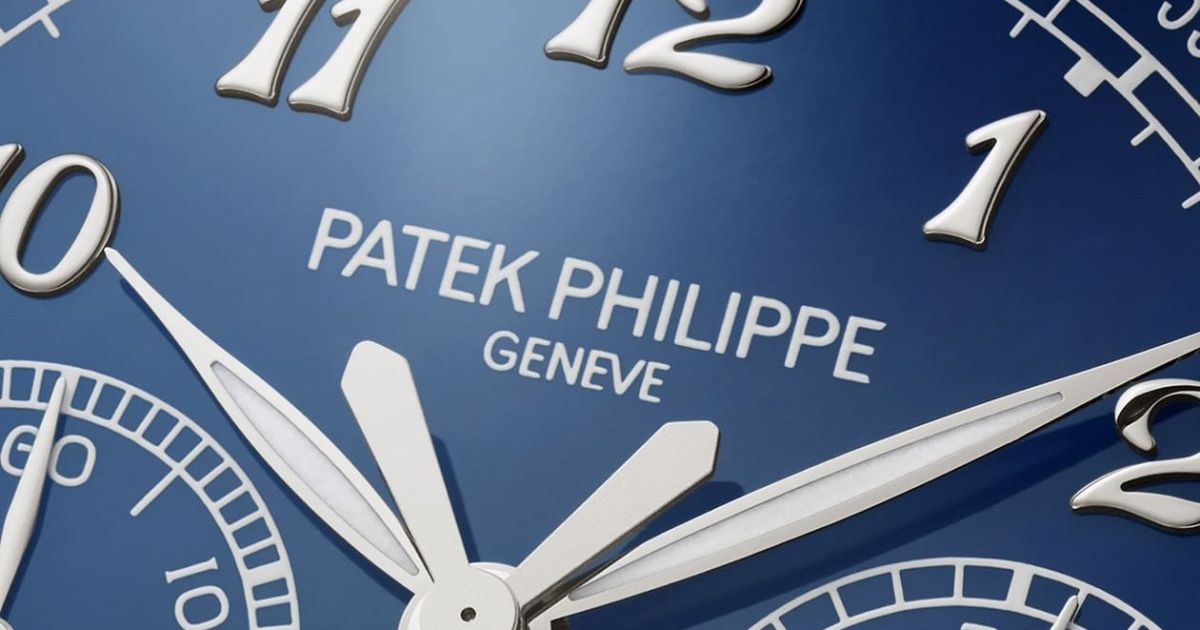
The Text and Signatures: The Voice of Identity
Every word on the dial is a statement. The brand signature is its identity. The font, placement, and even the printing technique (raised, engraved, or painted) matter immensely.
Other text might indicate the model name, the presence of an automatic movement, special certifications like a chronometer status (signifying superior accuracy), or specific technologies. Less is often more; a clean, uncluttered dial is a sign of confidence.
The Date Window: A Simple Yet Complex Detail
A seemingly simple feature, the date window’s execution speaks volumes about the watch’s quality.
- Aperture: The simple cut-out in the dial.
- Date Wheel: The disc underneath that displays the dates. On a high-end watch, you want the color of the wheel to perfectly match the dial color. A mismatched wheel is a tell-tale sign of a lower-tier manufacture.
- Frame/ Cyclops: Some brands add a metal frame around the aperture for a finished look. Rolex famously uses a “Cyclops” magnifying lens over the date on the crystal for enhanced legibility.
The Outer Chapter Ring and Scale
This is the ring, often on the very periphery of the dial, that can carry additional markings.
- Minute/Seconds Track: The most common, with tiny hash marks for reading seconds or precise minutes.
- Tachymeter: Used to measure speed over a fixed distance, common on chronographs.
- Pulsometer: Measures heart rate.
- Telemeter: Measures distance based on sound (e.g., the distance to a lightning strike).
Conclusion: The Dial as a Narrative
The next time you look at a watch, don’t just check the time. Take a moment to read its dial. Look at the texture of the base, the craftsmanship of the applied markers, the elegance of the hands, and the harmony of all its elements. Is it a tool watch built for legibility? A dress watch radiating minimalist elegance? A complex masterpiece showcasing technical prowess?
The dial is the narrative center of the watch. It’s where the watchmaker’s intent is most clearly communicated. By understanding its anatomy, you unlock a deeper, more meaningful connection to the art you wear on your wrist. It’s not just about telling time; it’s about understanding a story.