Blog
Watch Dial 101: A Beginner’s Guide to the Face of Your Timepiece
Welcome, fellow watch enthusiast. You’ve embarked on a journey into the captivating world of horology, a realm where mechanics and artistry collide. While the intricate movement inside your watch is its beating heart, the dial is its soul. It’s the canvas upon which time is painted, the primary interface between you and the micro-engineering marvel on your wrist.
Often overlooked by novices, the dial—or the “face”—is where a watch’s character is truly defined. It can whisper elegance, shout sportiness, or command professional respect. Understanding its components is your first step towards truly appreciating any timepiece. So, let’s dive into the essential elements that make up a watch dial.
The Base: The Dial Plate & Its Finishes
Before any indices or text are applied, the dial plate itself sets the stage. The way it interacts with light is fundamental to its personality. Here are some of the most common finishes you’ll encounter:
- Guilloché: A hallmark of high-end watchmaking, guilloché is an intricate, repetitive pattern mechanically engraved into the dial using a rose-engine lathe. The result is a stunning play of light and shadow, with classic patterns like Clous de Paris (hobnail) or sunray brushing. It signifies exceptional craftsmanship.
- Enamel: The epitome of classic elegance. Enamel dials are created by fusing powdered glass to a metal base (often gold) at extremely high temperatures. The result is a deep, luminous, and virtually impervious surface that can last centuries. Grand Feu (Great Fire) enamel is the most prestigious, requiring multiple risky firings to achieve perfection.
- Lacquer: Offering a similar deep, glossy effect to enamel but with a different technique. Lacquer dials are made by applying multiple layers of lacquer (often urushi, a Japanese natural lacquer) and polishing them to a mirror-like shine. They provide a rich, uniform, and intensely saturated color.
- Matte: A flat, non-reflective finish that is highly functional and tool-watch oriented. It’s often seen on field watches and pilot’s watches for its legibility and understated tool-like aesthetic.
- Textured: This can range from simple graining to more complex patterns mimicking meteorite, stone, or wood. These dials add a unique, organic, and often contemporary feel to a timepiece.
The Markers: Indices and Numerals
These are the hour markers on the dial. Their style is a major contributor to the watch’s overall vibe.
- Indices: These are applied metal markers (often stick-shaped, triangles, or diamonds) that are fixed onto the dial. “Applied indices” are a sign of a higher-quality watch, as they are separate components that add depth. A lume plot is a index filled with luminous material.
- Numerals: These can be printed or applied.
- Arabic Numerals: Bold, highly legible, and often associated with military, pilot, or sport watches.
- Roman Numerals: Evoke a classic, traditional, and dressy feel. Commonly found on timepieces from brands with a long heritage.
- Breguet Numerals: An elegant, stylized font often seen on classic dress watches, named after the legendary watchmaker Abraham-Louis Breguet.
A key layout to know is the California Dial, which features a mix of Roman numerals for the first half of the day and Arabic numerals for the second, offering a unique, vintage-inspired look.
The Hands: The Pointers of Time
The hands are the dancers on the dial’s stage. Their design is crucial for both legibility and style.
- Mercedes Hands: Iconically used by Rolex on their Submariner, this hand has a circular base with a three-pointed star, originally designed to provide a large area for luminous material.
- Alpha & Dauphine Hands: Elegant, tapered hands often found on dress watches. Dauphine hands are faceted to catch the light, creating a beautiful shimmering effect.
- Sword & Baton Hands: Simple, broad, and highly legible. Sword hands are slightly tapered, while baton hands are more uniform in width. They are versatile and found on everything from dress to sport watches.
- Snowflake Hands: A signature of Tudor, these are broad, square-tipped hands designed for maximum legibility, especially in diving conditions.
The seconds hand, or “sweep” hand, often has its own distinct style, sometimes featuring a counterweight or a brightly colored tip.
The Complications: Beyond the Hours and Minutes
Any function on a watch beyond displaying hours, minutes, and seconds is called a “complication.” The dial is where these are displayed.
- Date Window: The most common complication. It can be a simple aperture at 3 o’clock, or more elaborate displays like a magnifying “cyclops” lens over it, or a date window at 6 o’clock for symmetry.
- Day-Date: Shows both the day of the week and the date.
- Chronograph: A stopwatch. This adds sub-dials (or “totalizers”) to the main dial to measure elapsed seconds, minutes, and hours. The layout of these sub-dials is a key characteristic.
- Moonphase: A beautiful, poetic complication that displays the current phase of the moon in a small aperture on the dial.
- GMT / Dual Time: Features an additional hand that makes one revolution every 24 hours, allowing the wearer to track a second time zone. It’s often paired with a 24-hour scale on the bezel or dial rehaut (the inner ring).
The Subtle Details: What Makes a Dial Sing
It’s often the smallest details that separate a good dial from a great one.
- The Rehaut: The angled ring between the dial and the crystal. On some watches, it may be engraved with a minute track or branding.
- Lume: Short for luminescence. A phosphorescent material (like Super-LumiNova) is applied to the hands and indices, allowing you to read the time in the dark. The color and intensity of the lume are important to fans of tool watches.
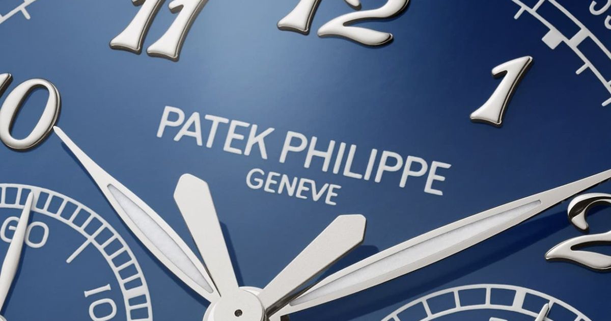
- Printing & Logo: The quality of the printing for the brand name, model, and other text is a telltale sign of quality. Is it crisp, raised, and perfectly aligned? Is the logo applied in metal or simply printed?
- Subsidiary Dials: These are the smaller dials within the main dial for complications like a chronograph or small seconds. Their design and finish should harmonize with the main dial.
Conclusion: Your Personal Connection
The dial is the storyteller of your watch. It’s the first thing you glance at, the element that catches the light and a stranger’s eye. By understanding its language—the textures, the shapes, the layouts—you move beyond simply owning a watch to truly understanding it.
The next time you look at a timepiece, take a moment. Study its face. Ask yourself: What is it telling me about its purpose and its pedigree? Does the guilloché catch the light in a way that makes you smile? Is the lume bright enough to be a trusted companion in the dark? Your connection with a watch is deeply personal, and it almost always starts with a conversation with its dial.
Now, go forth and observe the wonderful world of watch dials with a newfound appreciation